
To preface: I have hardly any experience with CSS and building websites. I basically just winged it for my last site and this one.
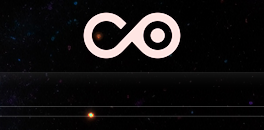
I started out by simply wanting the logo in the header of my website to have a clean little animation whenever the website loaded. I wanted this .GIF to loop once any time the website loaded:
(This version loops, just so you can see what I was going for animation wise)
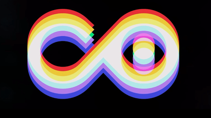
You can see the edges of the .GIF have a chunky, horrible look. At this point I felt forced to settle for the static image with no animation.
Although later on, while putting the finishing touches on my sites CSS with the help of the handy dandy ChatGPT, I came to the realization I might be able to use this tool to achieve my goal after all.
I also quickly found you can apply blend modes to images with CSS same way you can in Photoshop.
Creating the foundation
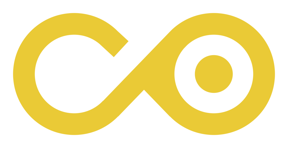
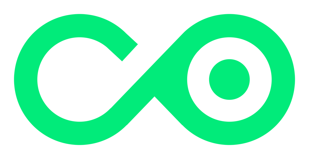
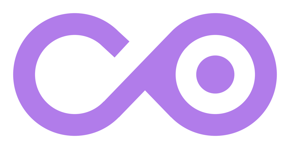
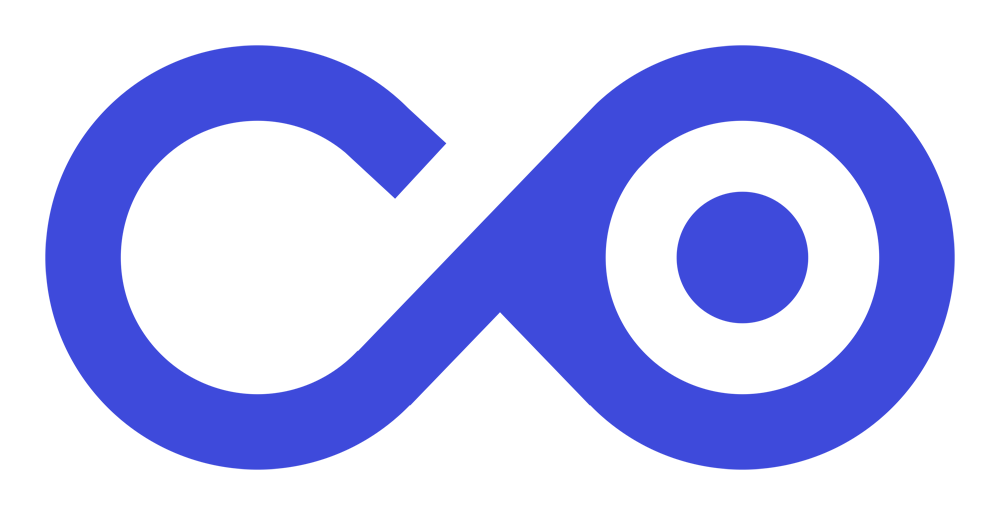
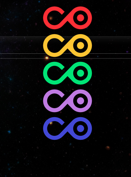
First, I created separate transparent .PNG of the logo in the colours I knew would cancel each other out to create white, in the same way I made the static image.
I edited my sites header.php file directly to add all of these images in to their own div, and gave them unique class names to manipulate with CSS later.
<a href="https://coltography.ca/">
<div class="king-logo">
<img src="https://coltography.ca/wp-content/uploads/2023/04/l1-co-red.png" class="logo-img-1"/>
<img src="https://coltography.ca/wp-content/uploads/2023/04/l2-co-orange.png" class="logo-img-2"/>
<img src="https://coltography.ca/wp-content/uploads/2023/04/l3-co-green.png" class="logo-img-3"/>
<img src="https://coltography.ca/wp-content/uploads/2023/04/l4-co-purple.png" class="logo-img-4"/>
<img src="https://coltography.ca/wp-content/uploads/2023/04/l5-co-blue.png" class="logo-img-5"/>
</div>
</a>
After a quick refresh, I saw they had shown up on the header but they were all stacked on top of each other given there was no CSS styling yet.
At this point I was getting a little giddy and asked ChatGPT to write me some CSS quickly to align them all on top of each other, and apply the blending mode “lighten”, the same way I did in Photoshop.
.logo-img-1,
.logo-img-2,
.logo-img-3,
.logo-img-4,
.logo-img-5 {
  position: absolute;
  top: 0;
  left: 0;
  mix-blend-mode: lighten;
}
The result, so far:
While not completely a perfect white, it was at least working nearly as intended. The colours I could fine-tune later. At this point I decided I didn’t want the logo to animate on a page load, and instead wanted it to animate when a mouse hovered over it.
Inspecting the element showed me this:
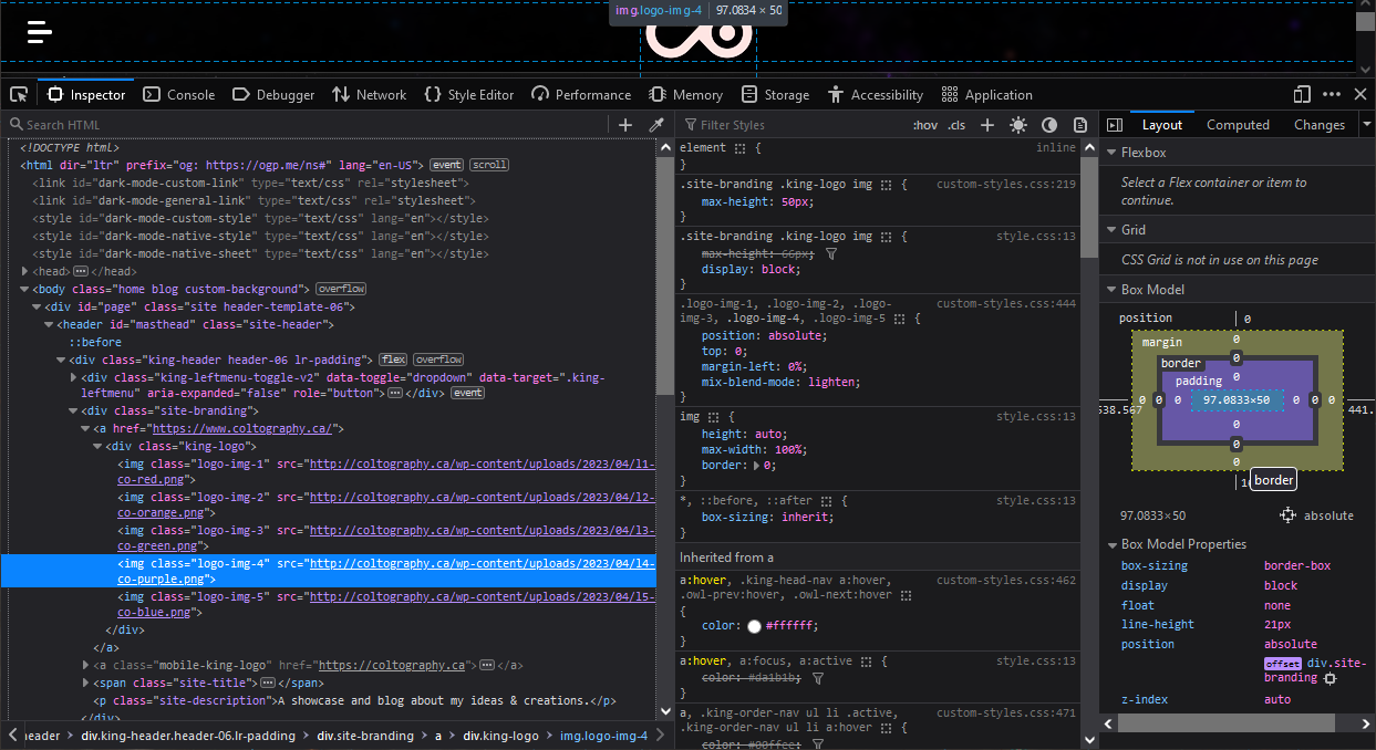
What am I looking at?!
At this point I was getting lost. I want to style that “hover” element but applying any styles to “a:hover” did nothing. Knowing the div I added all the images to was “king-logo” I simply asked ChatGPT to make the logos align themselves on hover, and then when NOT hovered, them all a negative or positive offset that I would alter later.
Wrapping it all up
I’ll skip over the boring parts, but after some painful back and forth, lots of troubleshooting and added clarification, this is the code it I was able to get out of ChatGPT:
/* Initial styles for the logo images */
.king-logo img {
  position: absolute;
  max-width: 180px;
  mix-blend-mode: lighten;
  top: 0px; /* Update to initial offset value for each image */
  transition: top 0.4s ease; /* Add transition effect for smooth animation */
}

/* Hover styles for the logo images */
.king-logo:hover .logo-img-1 { /* RED */
  top: 0px; /* Update to desired overlapping offset value */
}

.king-logo:hover .logo-img-2 { /* ORANGE */
  top: 0px; /* Update to desired overlapping offset value */
}

.king-logo:hover .logo-img-3 { /* GREEN */
  top: 0px; /* Update to desired overlapping offset value */
}

.king-logo:hover .logo-img-4 { /* PURPLE */
  top: 0px; /* Update to desired overlapping offset value */
}

.king-logo:hover .logo-img-5 { /* BLUE */
  top: 0px; /* Update to desired overlapping offset value */
}

/* Reset the initial offsets when not hovered */
.king-logo .logo-img-1 { /* RED */
  top: -5.5px; /* Update to initial offset value */
}

.king-logo .logo-img-2 { /* ORANGE */
  top: -3px; /* Update to initial offset value */
}

.king-logo .logo-img-3 { /* GREEN */
  top: 0px; /* Update to initial offset value */
}

.king-logo .logo-img-4 { /* PURPLE */
  top: 3px; /* Update to initial offset value */
}

.king-logo .logo-img-5 { /* BLUE */
  top: 6px; /* Update to initial offset value */
}
You can see I ended up giving the upper red layer an offset of -5.5px because for some reason 6px just looked too thick, but in the end it looked exactly how I wanted, and acted exactly how I wanted.
In conclusion, I wasted the better part of my day making a silly little animation that hardly anyone will see.
But I had so much fun doing it, and I was pretty mind-blown I could leverage a free online language model to teach myself some things I never thought possible with my limited knowledge of CSS / HTML.
Not only did I learn a lot doing this, but it expanded my mind and took away some limitations on my imagination with what I could do with my website going forward.
If you have any questions or comments about this, feel free to email me!
